Showing posts with label Interior Design. Show all posts

Monday, March 9, 2009

Ultron Color Trends - Chicago Designer Event Insights

In this post, brace yourself for fascinating insights from designers in Chicago about color and color inspiration...

“Color can’t be in isolation.”

For background on these fascinating designer events, read Ultron Color Trends - Designer Workshops. You see, Ultron carpet fiber brought together seasoned designers in a first-ever series of four workshops to discuss color trends. The events took place in 2008 over an eight week period in four cities around the country: Los Angeles, Seattle, Chicago and New York.

Eight to 12 designers were invited to each event and asked to bring inspiring color chips, samples, magazine articles, photos and swatches. Ann Hurley acted as facilitator and guide for the sessions.

Here follow color family details and insights from the Chicago session:

Neutrals -
This brown, a neutral, nature inspired color, is versatile and sophisticated. Various shades of this color will work as a strong neutral base for any palette and can be used on large surfaces – floors, walls.

It’s clean and simple, and when used with stronger neutrals, the look is rich and sophisticated. It could be used on large areas – walls as well as upholstery, and window treatments.

What could be more attractive than the color of Earth itself? We’re always looking for that perfect dark brown: not too red, not too dull….. The smooth warm tone of this brown is a perfect compliment to any blue or red or neutral.

Warm neutrals with texture help evoke a feeling of hospitality or home; they bring warmth to a space. These colors can be used as a base or provide an accent when used with lighter colors.

Fashion influenced this color direction for the brown family. Warm neutral greys are used with a splash of bright color (e.g., gold) creating an interesting balance of light and dark. Warm neutrals set a back drop or create the environment/surroundings to allow other elements to come through and be the focus.

Tortoise Shell. Coco Bean/Rich soil/bronze.

White will remain “hot” as a major influence of room color and product materials, but will be warmer to avoid the stark retail look of the past few years.

“Graphite” is the new "Chocolate.” It will be used as an accent and blends well with the retro-grey washed woods that are becoming popular.

With 80s retro becoming popular, a cool grey mid-tone will come back as a complement to white dove, graphite and currant red palette that was popular in the 80s but warmed up for the ‘08s.

Layer of neutrals-tone on tone variations (underlying palette in most schemes).

Blue- Green

Water colors. The color of froth at the end of a wave - effervescent - fresh & clean.

Aqua in glass accents, where the intensity varies by region and is influenced by water.

This yellow green color is a nature inspired neutral color. It would work well as an accent on upholstery, window treatments or accent walls (also an accent end in carpet).

This nature inspired neutral could be an alternative to rich greens, but can also be used with rich browns and burnt oranges. Sophisticated and universally appealing, it’s clean and simple, and when used with stronger neutrals, the look is rich. It could be used on large areas such as walls, as well as upholstery and window treatments.

Fashion has often led the way for the color and texture of interiors. It's certainly setting the stage with this vibrant yellow – green midst dusky hues of the forest trail. These colors are also seen in the whimsical art-nouveau T-strap shoes, again painting with the vibrant colors of nature.

Biomimicry – Nature influences design and color choices. This vibrant green color adds a pop of color or accent to any space. Green signifies growth, renewal, health and environment. It could be used in combination with almost any neutral color.

Yellow- Orange- Red

These red colors are intense, and enhanced by the richer wood colors. They would work as a strong accent color in conjunction with rich browns for upholstery, window treatments or small accent walls.

With eco-friendly fervor spreading across the nation in every market sector, everyone is finally getting on the sustainability band wagon. People are realizing that they are going to have to step-up and join in the green movement or they are going to be left behind. It’s affecting our decisions daily. This red color is based on nature’s vibrancy; a bright and natural color that has energy and confidence. The bright orange-red color of a blood orange relating to the color of the hibiscus in the background is the new eco-red and it’s “sustainably stylish”.

Red is always popular but will move away from the orange hues and into berry tones.

A trend from fashion is a dark navy and dark plum with a black tint.
Next, the findings from the New York workshop.

For the findings from the previous Ultron Color Trends events:
+ Seattle Designer Event Insights


Monday, February 9, 2009

Design Reviews From the Floor Up ~ 2Modern Design Talk

February's Design Reviews From The Floor Up introduces you to 2Modern Design Talk, the design blog for the 2Modern retail site.

2Modern Design Talk is filled with delightful inspiration. Originally launched in August 2005, the site now features the perspectives of 18 contributors all involved in varying aspects of modern design - from different parts of the world [Chile, Brazil, Australia and the United States], a range of designing angles [graphic, object, furniture, showroom, industrial....] and interests [trend spotter, buyer, artist, painter, writer, crafter...].

The end result is a rich site featuring a "wide-range of views and commentary focused on contemporary design" as About 2Modern Design Talk explains. It's also very approachable and visually inspiring with delicious photos about modern design topics of interest to us all.

Take Sushi Artwork. Or lighting fixtures from the 2009 Interior Design Show in Toronto. What about Biomorphism and Solar Design and Wallpaper From the 70's? Or amazing Big scarves for this season. Check out New Rugs from 2Modern & Emma Gardner Designs!, too.

2Modern Design Talk will definitely take you on an excitingly fresh journey through contemporary design. Even if modern isn't your preferred design style, you'll be surprised by the relevance of the ideas showcased, and you never know when something might make sense for what you're trying to achieve.

Let me know what you think.

For previous sites included in this series, click on Design Reviews from the Floor Up. Or, visit our sidebar also titled 'Design Reviews from the Floor Up.'

Technorati Tags: Del.icio.us Tags:

Friday, December 5, 2008

Create A Color Palette To Coordinate Walls, Carpet, Furniture & More

How do you select colors for a room design? How do you coordinate wall, carpet, furniture colors and more? Do you have a system for creating a color palette, or are you paralyzed with indecision?

In either case, you might want to read Designer's Walk, by Sonna Calandrino, Fabulous Floors Magazine's Editor-in-Chief. It's the ultimate guide to creating a color palette and appears in the Fall 2008 issue.

It's a beautiful article filled with terrific visuals based on the Wear-Dated Field Guide to Color - Color Folio 2008 that Ann Hurley was instrumental in creating. Using John J. Audubon images of birds, Sonna shows how Ann created four-color palettes from each print. Each set of colors can be used as is or in combinations of gradations [values] of each color.

[This link will take you to the blogpost that summarizes all of the elements of the Field Guide to Color.]

The lesson from the article is that a favorite work of art can become the basis for a color design palette. Simply pick your favorite 4 or 5 colors from that piece, decide which you find most livable - that becomes your primary color; the rest are accents - and build a room design around them. The result coordinates effectively and reflects something that truly appeals to you.

We are so honored that Sonna chose to base Designer's Walk on our Field Guide to Color, and believe you will find it both helpful and inspiring. Look for the 2008 Fall issue of Fabulous Floors Magazine.

Or, simply download a copy of the article, Designer's Walk, by clicking this link.

And, then, go forth and coordinate your walls, carpet, furniture and more based on the color palette you created from your favorite source of inspiration!


Technorati Tags: Del.icio.us Tags:

Wednesday, October 1, 2008

Design Reviews from the Floor Up: Apartment Therapy

An entire month has passed since I posted the first Design Review from the Floor Up, and I'm still just as obsessed with interior design as I was then. Lucky for you, this means that I have plenty of design Web sites to share with you. Unlucky for me, my checkbook can only handle so many fabulous area rugs, pieces of art and decorative pillows. (Oh, Target! Why must you be so darn design-oriented and affordable?)

This month, I'd like to tell you about a little treat called Apartment Therapy. Much like aroma therapy or message therapy, this delicious site offers a relaxing, calming view of the world. It's proof that everyone, even the most design challenged, can have an attractive room of her own in which to write, read, relax or be.

Apartment Therapy is a blog written by a number of people in six major U.S. cities: New York, D.C., L.A., Boston, Chicago and San Francisco. Its mission: "Helping people make their homes more beautiful, organized and healthy by connecting them to a wealth of resources, ideas and community online." Who can argue with that? Regardless of your income or position in life, if you enjoy good design, you're welcome at Apartment Therapy. Creating the aforementioned healthy home "doesn’t require large amounts of money or space. It requires inspiration, connection to resources and motivation to do something about it."

At Apartment Therapy, the editors post numerous times each day from locations all over the world. On any one day, you can tour luxurious homes, read about styles like Hollywood Regency (as we discussed in Hollywood's Impact on Design), or check out great shops or products - all from the convenience of your home computer.

Apartment Therapy has even gotten so popular that they've broken out into four additional Web sites: Ohdeedoh (design for kids), TheKitchn (focusing solely that one important room), Unplggd (all about home tech) and Re-Nest (for environmentally friendly design).

We especially enjoy posts about carpet, like this one from Apartment Therapy Australia titled Rugs on Carpet. [Photo at left courtesy of Apartment Therapy. A Chihuahua with a "rug"-amazing, right?]

A word of caution, however. Apartment Therapy does have some addictive powers. You may get sucked in. You may even find yourself entering the fourth annual Fall Colors Contest 2008. But keep in mind, you have been warned.


Friday, August 22, 2008

Design Reviews From the Floor Up ~ Design*Sponge

Starting today, The Carpetology Blog is reviewing a design website once a month. Sure, you can think of flooring as, well, just flooring, or you can see it as we do - an element of design intrinsically connected to the ambiance and aesthetics of a room. Take Thom Filicia's advice: design from the floor up.

Since moving into my new flat, I've become obsessed with interior design. Until now, I've never had the opportunity to design a space all my own - home decor was my mom's domain as I was growing up, then I shared a dorm room and various apartments with other girls. And at that point, we had no money to spend on elements more expensive than futons and plastic end tables. (Yikes.) Now, it's time for a more grown up look for myself, and I'm discovering that the elements in my living space are a direct reflection of my personality - my home is most certainly an extension of myself.

Needless to say, when I have the time, I really enjoy looking at design websites, creative places where I can find new ideas, peruse photos, and search for style and color options that will work with my taste.

Today, we're starting with one of my personal favorites - Design*Sponge, known affectionately as D*S.

Founded by Brooklyn-based writer, Grace Bonney, D*S began in 2004. It's a daily blog and is often updated upwards of six times per day with delectable design bits and bites. "Design*Sponge features store and product reviews, sale and contest announcements, new designer profiles, trend forecasting and store/studio tours." It's a trip - Bonney is clever and witty, but in spite of her charm, her sense of style beats the pants off everything else. Each post has a new piece of design candy upon which to feast your eyes.

Posts range from the serious to the chuckle-inducing, the local to the international. Of course, our favorite posts have to do with carpet and area rugs. To check out some amazing treats for your tootsies, check out the Rug Roundup, Part 1 and Part 2.

We also think that this particular rug is simply scrumptious.

D*S also has links posts on design trends. My personal favorite is the numbers & letters mini trend, which makes me think of Mary Richard's classic 'M' hanging in her apartment in the Mary Tyler Moore Show. [Does anyone know where I can find an 'E' for my own place?]

You can also check out design guides to various cities all over the world, DIY tips every Thursday, and sneak peeks at an array of designers' homes. Basically, no matter what your style or price range, Design*Sponge has a little something for you.

Stay tuned... In September, we'll be introducing you to yet another fabulous design website in Design Reviews From the Floor Up.


Technorati Tags: Del.icio.us Tags:

Tuesday, April 15, 2008

Empty Pockets, Happy Feet & Casino Carpet

Photo originally uploaded by the Las Vegas Convention and Visitors Authority.
I may be a great many things, but a gambler I am not. The only reasons I've seen the interiors of the casinos in my city were to attend fashion shows, enjoy birthday parties, or, most importantly, eat dinner. So when I went to Vegas last year, I wasn't quite sure I'd enjoy myself (I most certainly did). Fortunately, Vegas' best feature (in my opinion) is not its gambling so much as its sight-seeing. And usually, you get far more than the eyeful you expect.

This vibrant visual effect generally translates to decor as well as entertainment, people and overall ambiance. And somehow, this effect then transcends space and time to reach casinos everywhere - they're all big and loud and bright and... gaudy? That determination is subjective, but regardless, they're in a interior design class all their own.

Which brings me to our favorite design element... carpet.

Surely you've noticed the carpet in casinos - it's hard to miss. Like everything else in a casino, it's big and loud and bright and gaudy. And it has begun to attract attention.

Dr. David G. Schwartz, "gaming's leading historian," according to his own Web site, writes about, blogs on, and generally lives the gaming and gambling industry. One of his ongoing projects involves photographing casino carpet in any and all casinos, then posting the photos to his site, The Die Is Cast.

Carpet from my favorite Las Vegas Hotel & Casino - the Bellagio.
Photo courtesy of
http://www.dieiscast.com/.

"Casino carpet is known as an exercise in deliberate bad taste that somehow encourages people to gamble," writes Schwartz on his Web site.

"In a strange way, though, it's a sublime work of art, rivalling any expressionist canvas of the past century. Note the regal tones of Caesars Palace, the bountiful bouquet of Mandalay Place, the soft, almost abstract pointillism of Paris, all whispering, 'gamble, gamble' just out of the range of consciousness as people walk to the nearest slot machine."

An article from March 30 in the Las Vegas Review-Journal quotes both Schwartz and Mike Nolan, general manager for El Cortez, discussing the benefits of casino carpet and remunerates the reasons why it's usually so bold and patterned.

Schwartz denounces the theory that casino operators deliberately try to make casino carpet garish so people look elsewhere - toward the slot machines or the craps tables for example. Instead, he sees reason in the idea that casino carpet is needed more for camouflaging inevitable unwanted dirt and stains. Nolan says that the patterns make the casino floor - an enormous space - much more contained and much less overwhelming. He adds that in years past, casinos used linoleum to cover the floors. Yikes!

Casino carpet makes such an impact that it's even included as a category in the annual Trippies - the very best and worst of everything in Vegas. Of all the carpet in Vegas casinos, Wynn Las Vegas [see Wikipedia's Wynn entry] won the Trippie's editor's best casino carpet award for 2007. Readers agreed. The New Frontier Hotel and Casino (now extinct - see its implosion here), was voted by the editors as having the worst carpet, while readers gave that distinction to Circus Circus. Visit Vegas Tripping to see the winners (and losers) of everything in Sin City.

Regardless of where you like to gamble, from Vegas to Atlantic City, you can't get away from the carpet. Embrace it as part of the casino culture, enjoy it for its gaudiness, and love that in its inherent nature, it cushions your feet as you lose your money.


Technorati Tags: Casino Carpet, David Schwartz, Las Vegas, Casino Deli.cio.us Tags: Casino Carpet, David Schwartz, Las Vegas, Casino

Monday, March 3, 2008

All right, Mr. DeMille, I'm ready for my close-up...or Hollywood's Impact on Design

Oscar Eve - Red Carpet originally uploaded by mikewakin.

Since we're interested in carpet of all kinds here at The Carpetology Blog, it would be a shame to let the biggest red carpet awards show of the year slip through our fingers without recognizing Hollywood's impact on design. Sunday night, February 24, was the 80th annual Academy Awards, perhaps the biggest event in the entertainment industry until it rolls out again next year.

Somehow, in spite of the number of red carpet events throughout the year, the Oscars still exude the very essence of glamour and Old Hollywood sophistication. This is the night the movie stars come out -- not the over-hyped celebrities with their purse puppies. The Academy Awards have a rich tradition dating back to 1929 that includes the most esteemed and talented individuals in the motion picture industry. Visit both Oscars.com and Oscars.org for the history of the Academy and its most glamorous event. [For more Oscar trivia try filmsite.org, a site that film critic Roger Ebert has often referenced in his critiques. It's full of delicious Oscar facts, including Academy Awards winners by decades and years, movie posters, quotes and trivia.]

Below: Bette Davis on the red carpet at the Academy Awards in 1936. Photo courtesy of Oscar.com.

Although the true glamour of Old Hollywood rarely makes an appearance these days, there are a few people who still make an effort to keep it alive. Kelly Wearstler, a high-end interior designer, was recently featured in Hollywood Regency Style Walks the Red Carpet in Today’s Polished Interiors, an article by Stacy Downs of the Kansas City Star. All about the "Hollywood Regency" style of design, Wearstler gets Hollywood glamour.

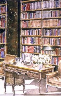
Below: a watercolor by decorator Mark Hampton of a library designed by Billy Baldwin for Cole Porter. Classic Hollywood Regency! Originally uploaded by Style Court.

When I first read the article, I wasn't familiar with the term 'Hollywood Regency'. But when you read its descriptions and visit Kelly's Web site, you're instantly transported to an earlier time, when slender cigarette holders were the height of sophistication, Edith Head still designed costumes, and people knew that MGM stood for the venerable film studio of Metro Goldwyn Mayer. For visual cues, think movies like the Thin Man series or Rebecca.

Characterized by such accents as animal hides, art deco furniture, lacquered finishes and baroque frames, Hollywood Regency is a blend of 1930s movie star glamour, mod graphics, and a "dash of bold whimsy," according to the article. "Broken down, 'Hollywood' is the ornate, glamorous part of the style. 'Regency' refers to the architectural period of the early 1800s, a return to classic lines such as Greek columns."

HGTV's blog, Design Happens, describes Hollywood Regency as it would a woman: "A more justified summation of her aesthetic would be to refer to her as a 'lifestyle' rather than simply a 'look-of-the-moment, 'Hollywood Regency embodies a spirit of living rather than the return to a specific type of design or a specific point in time. She's a way of life where people are truly living in the moment, and not distracted with text-messaging during dinner, or living a life where quality time together equates to quiet time in front of a television during premiere week."

It sounds luxurious in a comfortable sort of way, does it not?

The Kansas City Star article reminds us not to forget Dorothy Draper, William Haines and Billy Baldwin, all interior designers from the 1920s and 1930s whose work defined Hollywood Regency. [William Haines was actually a movie star before becoming an interior designer.] Each of these designers helped to transition the look of the time from heavy and dark to new and fresh, completely altering how people perceived interior design.

A William Haines room from William Haines Design. Photo courtesy of HGTV.com.


Needless to say, the spirit of Old Hollywood is alive and well - in design!

~Elizabeth

Technorati Tags: Del.icio.us Tags:

Related Posts Plugin for WordPress, Blogger...