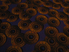
So, imagine my disappointment when I learn from Kizer & Bender's Retail Adventures in the Real World and their post titled Until now ... that New York New York Casino has opted to go generic with its carpet rather than use it as a means of reinforcing its brand and uniqueness compared to other destinations.
Look at this photo. The carpet captures NYC subway tokens. How much more NYC can you get, even if we have gone to MetroCards? Why would anyone -unless they were replacing the current carpet with Metro Card inspired carpet - change what so perfectly captures the NYC vibe and brand?
I explored NY-NY Casino with Kizer & Bender [see Kizer & Bender - First Impressions: The Art of Store Layout & Design] and saw firsthand the fun carpet themes they picture in their post. The change to something as drab and generic as they capture makes no sense. After all, isn't casino carpet supposed to be about preposterous whimsy and so epitomize a sense of unique space that one is overcome and unwilling to go elsewhere?
If you've seen the new carpet, what's your take? Is it more soothing and hence more conducive to spending time at New York New York?
Or is it so bland that it does nothing to reinforce and remind you why where you are is special and that you should remain there because it is so unique?

Technorati Tags: NYC NY-NY Las Vegas casino carpet carpet in the news brand experience Del.icio.us Tags: NYC NY-NY Las Vegas casino carpet carpet in the news brand experience


2 comments:
Hi Christine,
Generic carpeting at NY-NY could work if it had, say, an art deco theme, but the carpeting we saw last week could work in any casino.
Many of the casinos are redecorating using a lot of browns, creams, and blues with dark woods. It used to be a lot easier to identify which property we were in. Now the lines are blurred because they're all using similar materials, even similar fonts in interior signing.
It's sad to see the things that make each property unique go away. No matter how luxurious, the "same old, same old" gets awfully boring, don't you think?
Georganne Bender
kizerandbender.blogspot.com
Georganne,
I absolutely agree! It's awfully similar to the curse of beige plaguing so many carpet stores, and counter-intuitive when you think how much money goes into products that do nothing to make a brand stand out.
Thanks for commenting!
Post a Comment