Showing posts with label carpet design inspiration. Show all posts

Thursday, December 22, 2011

DOMOTEX 2012 Carpet Trends

DOMOTEX 2012 Carpet Trends
DOMOTEX 2012 has just released an ebook with Carpet Trends for 2012. It's visual candy and wonderful inspiration for ideas on what's possible with carpet style and fashion trends.

The document refers to three trends:

1. Fashionable: Stylish and Eye-Catching Carpet


2. Natural: The New Organic Look


3. Classic: Timeless Design With a New Twist

You can download the DOMOTEX Carpet Trends 2012 by clicking on this link.

I'd love to hear your reactions. Which carpet trend do you find most interesting? Which might you include in your home design scheme?


Monday, April 11, 2011

Wayfinding With Carpet: Cell+LED

Wayfinding With Carpet: Cell+LED
Sadly, intense carpet innovation doesn't happen that frequently as FastCompany's FastCoDesign observes. However, in this case the carpet innovation is intensely brilliant!

Dutch company Lama Concept recently introduced Cell+LED which integrates lighted wayfinding into the carpet.

You can read more in FastCoDesign's article titled Dutch Company Integrates LED Wayfinding Into Its Carpets. LEDs tucked into Lama Concept's Cell+LED carpet create customizable lighting where people look the most -- on the ground. Do check it out. The photos alone were enough to have me re-imagining the future and carpet!

The article shows examples of the product in new concept airplanes and refers to a concept Land Rover. Cell+LED creates a dynamic corporate space, too.  I'd love to see this used in medical or hospitality environments. Imagine a movie theatre or a school!

What's your reaction? How might you integrate wayfinding into your home?

Thursday, March 10, 2011

Rug Rag For Area Rug & Carpet Style Inspiration

David Dilmaghani, Rug Rag
Area rugs and carpet represent the ultimate flooring design statement. For that reason, I share with you an interview with David Dilmaghani, co-founder of RugRag.com, which specializes in traditional and decorative rugs and carpets, and an article he wrote for The Carpetology Blog about rug and carpet style inspiration.

C.B.: Dave, tell me about Rug Rag. How did the company get started?

DD:  My brother Matthew and I co-founded the website RugRag.com in 2007. Rug Rag is a resource for those interested in learning about Oriental rugs, antique rugs, and area rugs. As the tech man for Rug Rag, Matthew has brought many of our interactive consumer widgets to life. With my specialty in hand knotted rugs, I author the vast majority of information in our Rug archive and on-site tools, and serve as a rug consultant for our readers and their questions on a daily basis.

One of the first tools we created was the Rug Estimator Pro: an interactive sampler tool to help consumers understand some determining factors which go into the assessment of new and used hand knotted carpets. Estimates rendered from this tool are actually derived from several thousand individually assessed and valued carpets from around the world, many of them from notable auctions and inventories of nationally recognized rug importers.

C.B.: How did you become interested in rugs?

DD:  My brother and I come from a long line of history in Persian rugs, so it was natural for me to learn about them at a very young age. Many memories of our younger years consist of being surrounded by carpets at our father's rug showroom in New York. However, it was not until I reached my late teens that a true appreciation for this artisan craft quickly turned into a hobby, and then passion.

C.B.: So your passion for rugs, a marvelously tactile and visual product, led you to the online world. How did that happen?

DD: In the late 90s, I truly pursued my interests in rugs and started researching the subject. As with any research project, there's a very steep learning curve at the beginning. With rugs, the mystique of a fine rug often either intrigues an individual to know more or overwhelms them to the point of confusion. Additionally, a great deal of misinformation on rugs remains rampant online. In many instances, less reputable sellers continue to exploit first time buyer misconceptions with "sale" prices.

We saw a need for a reliable resource for rug information and launched Rug Rag.  It's a destination for consumers to learn with us or, using easy-to-use tools and resources we've made available on our website, they can learn on their own. One example of this is our Oriental rug forum, which continues to be an excellent resource and unadulterated center for interacting with specialists in the field of Oriental rugs.

I spend much of my time attending rug auctions - this picture of me was taken at a recent Sotheby's auction - browsing carpets online and consulting with consumers about their carpets.

C.B.: Absolutely fascinating!

And now, here is the article that David Dilmaghani from RugRag.com shares with us about area rug and carpet style inspiration.

--------------------

There is little question that many years ago your interior designer would say timeless designs and classic motifs of reds and blues were the bread and butter of their business. Now, the new wave of area rugs is of an entirely different breed.

Contextually, area rugs are among the easiest and most versatile decorative items within a space. By mere definition, area rugs are movable. By exploiting this inherent characteristic comes clear benefit of freedom. Without question, it is an exciting time to be a consumer in this market as the carpets now available are clearly
aligned with this spirit of decorative freedom.

Centuries ago, it was not uncommon to find what we now call area rugs to be throws and cover-alls above the floor. Carefully draped atop tables and chair-backs of the elite and well-to-do, Post 18th century, area rugs (traditionally hand-knotted rugs) were introduced back onto floors. Not only was this an aesthetic movement, but also in part, to serve their intended utility. Although rugs have been made for many, many centuries with varying techniques, weaving styles and textures, specifically now what is being presented to the market are extraordinarily progressive, and perhaps exponentially more integrative area rugs. Revivals, new weaving styles, materials, motifs, and even artist statements are bringing this somewhat traditional market to an entirely new era of floor covering. With the onslaught of the internet, almost any permutation of an area rug floor covering can spread like wildfire.
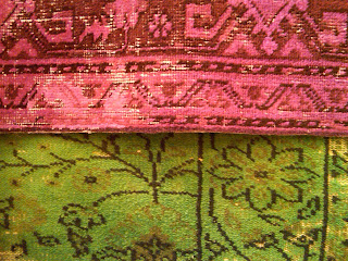
area rug style inspiration: Color Reform

As an ode to classic and traditional and classic designs (and a bit of shabby chic) with a twist of color come worn semi-antique Turkish carpets. Exhibiting wear pattern and strong overtones of post-production coloring, Color reform, as ABC calls their line of transformed art, makes new headway by rejuvenating otherwise deemed retired carpets.

Reinventing relics with brilliant, upbeat colors for a dazzled effect is what these whimsical carpets are all about. What a statement in how simple and effective use of color can bring entirely new emphasis on decorative value. Plus, they can be green. Literally and figuratively.

Area Rug Style Inspiration: Patchwork Style Rug

Old design adapted and reintroduced into the marketplace is not limited to Color Reform carpets. Patchwork rugs, perhaps many years ago seen as the “seersucker” of area rugs, are exploding within the marketplace – so much so they’re being woven in one piece as opposed to being sewn together. These sometimes mismatched and haphazard integration of snippet designs completely transcends traditionalism in many ways.

With few exceptions, hand knotted rugs have largely been unbranded for the past century. Samad, a renown importer of fine hand knotted carpets, literally brings art back to the floor with a new twist.

Area Rug Style Inspiration: Rex Ray Samad Collection: title=

Examples such as the Rex Ray collection provides duality - the prestige of a Samad rug with additional decorative appeal from the work of San Francisco based graphic designer, Rex Ray. Beautifully rendered and expressive designs adapted within the age-old technique of a hand knotted, piled carpet.

Traditional Flokati shag, not entirely dissimilar to the thick piled carpets of the 60s and 70s, seemed to have risen back into the marketplace as a high contender in the 90s and early 2000s. However, it seems many forgot how frightening these types can potentially be to keep clean, let alone vacuuming. Newer developments include a thick pelted felt pile with fat, nubby pile. This translates into an entirely different visual effect, but more so, a completely new consumer experience AND sensation while walking on these unique area rugs.

Timeless and classic motifs of yesteryear continue to have heavy momentum within the new market of area rugs. Although the new market in area rugs is constantly evolving, often incorporating bits and pieces of the old (literally). In a highly interactive world, with constant changes and developments continuing to propel the area rug market forward there is no question that rugs are the best investment of choice: Adaptable decorative items within interior design in many cases, providing a tangible experience in home decor harnessing your
room, whether on the wall, table, or of course the floors.

------------

Thank you, David, for sharing this marvelous area rug and carpet style inspiration! Rugs truly are the ultimate in design statements and these examples you've shared with us are marvelous!

I'd love to hear reactions to these area rug styles. Which is your favorite? How do you see using such design statements in your home?


You can reach David Dilmaghani on www.RugRag.com, on Facebook or via email at info@rugrag.com.

Wednesday, January 12, 2011

Want Carpet? Pick a Number!

Want Carpet? Pick a Number! The Mathematical Carpet
From what I've observed, flooring - and carpet - tends not to get the attention and credit it deserves for completing a room design. The floor matters aesthetically and practically. It also creates opportunity for conversation (i.e., human warmth) and I love encountering carpet examples that help make that point. In this case, it's via numbers. Hence the title to this post: Want Carpet? Pick a Number!

More specifically, numbers as in this carpet labeled "The Mathematical Carpet" which I learned about via The Mathematical Carpet in The New York Times.

This "Mathematical Carpet" features - what else but... numbers. The end result is a numbers-based, Abstract-Expressionist inspired carpet designed by Hokanson's Carpet [Note: website relentlessly plays Sinatra's "Do it my way"] in Houston, TX.

Each rug is custom made which -to me- means that you can pick and choose which numbers best suit your fancy.

I particularly love the range of colors and the lack of bland beige-ness.

Imagine the conversations you might have as a result of a number-inspired carpet: the state of the economy, how successful you were in closing your last deal, reviewing addition, subtraction, multiplication and division with your children, the order of numbers, probability, proportions in recipes, ... The possibilities are endless!

Wouldn't an alphabet version be fun, too? With a mixture of script and print and a range of handwriting styles. I'd identify it as "The Handwriting Carpet".

What's your reaction? What carpet designs have you come across that lead to interesting conversations? Any that are number-based?

Wednesday, December 22, 2010

Carpet Design Inspiration: Meagan Webb, tx:style Winner

Carpet Design Inspiration: Meagan Webb, tx:style Winner
Mannington Commercial has just announced the 2011 tx:style Design Challenge.This is the third year of the competition and the resulting carpet design inspiration is truly electrifying.

I first wrote about tx:style Design Challenge in Mannington Commercial Carpet Design Competition - tx:style in December 2008. I was thrilled to hear back from Carly Rullman from Scout Brand - who coordinates tx:style - about the 2011 tx:style Design Challenge and asked her for perspective on the competition and on carpet design inspiration resulting from the program. Carly graciously put together the following interview with 2009 tx:style Design Challenge winner, Meagan Webb on her Squareberry Collection.

[Note: here are details for participating in the 2011 tx:style Design Challenge.]

From Carpet Concept to Installation: An Interview with 2009 tx:style Design Challenge Winner, Meagan Webb

By Carly J. Rullman

In the Nashville VA Hospital, there lies an area with brand new carpet flooring- a design called Canopy. Inspired by the finite details of nature, Canopy is part of the Squareberry Collection which healthcare designer, Meagan Webb, entered into the 2009 tx:style Design Challenge. Meagan Webb also won the first tx:style Design Challenge.

Now in its third year, the tx:style Design Challenge gives designers a platform to showcase their talents and a shot at having their design turned into a complete product line by Mannington Commercial. Meagan tells us about her experience in going from carpet concept to installation.

What prompted you to enter the tx:style Design Challenge?
I heard about the tx: style Design Challenge at a very sensitive time. The healthcare design firm for which I was employed experienced large layoffs due to the economic challenges that many architecture firms have experienced. I was affected by the layoff; therefore, a former coworker called to check on me and mentioned the contest. She encouraged me to enter, but the catch was—it ended that week! I decided to go for it and got to work immediately.

What inspired the Squareberry design?
I am amazed by the beauty of God’s creation when hiking. The finite detail that was put into creation astounded me. I noticed that not one leaf was identical to the next. As I pondered, I contrasted the way God designed the world with the way man interprets creation. Man sees everything on a grid. Everything has a size, shape and increment.

Squareberry contrasts the organic shapes of creation with the rigid grid that we design and see through our own eyes. This creates a delicate juxtaposition of geometry and organic forms.

Did you have any particular installations in mind when you were designing Squareberry? 
Naturally, I thought of healthcare installations; however, I think the carpet design would work well for hospitality or retail applications, as well.

What 3 words would you use to describe Squareberry?
Organic, geometric, layered.

How was your NeoCon experience? [Note: finalists of the tx:style Design Challenge are awarded a trip to NeoCon World’s Trade Fair in Chicago.]
My 2009 NeoCon experience was indescribable. It was amazing to network with other designers from around the country and share the Squareberry design story. It was intriguing to learn about the other designers’ inspiration stories. Hearing those stories made me realize one can truly find inspiration anywhere. I really enjoyed getting to share this experience with the other extremely talented finalists. It was an opportunity of a lifetime that I will never forget and hope that many other designers get to experience it as well.

What have been the biggest challenges you've faced as a young designer?
The biggest challenge I have faced as a young designer is beginning and continuing my career in the current economic times. I have been forced to be creative and diversify myself as much as possible. While looking for a job, I did residential and commercial freelance work, including landscape design, graphic design and interior design, as well as renovating historic homes in Nashville. This was my opportunity to try new ventures and discover what aspects of design I was passionate about.

What are your goals for Squareberry?
I would love to see the entire Squareberry carpet collection installed in a healthcare facility lobby. I would relish the opportunity to continue designing carpet in the future and hope to build upon this experience. I really enjoyed the detail of pattern making and the process from concept to installation. It opened my eyes to the opportunities in carpet and textile design.

What are your goals as a designer?
I plan to continue my career as a healthcare designer working at the Nashville VA Medical Center serving our veterans. I find healthcare design a rewarding field by knowing I am creating a healing environment for those who are suffering. To keep my creativity fueled, I will purse my personal venture of renovating historic homes and businesses in east Nashville.

Where can someone find an installation of Squareberry?
I recently had the opportunity to install Canopy, a Squareberry carpet coordinate, in the Nashville VA Hospital Medical Services department. This was such a rewarding experience that brought the design to life.

What makes up the Squareberry line exactly?
Squareberry- Juxtaposes organic forms and rigid grid lines.
Canopy-Takes a closer look at the tree. Admiring the vast depth of the tree canopy. The deeper you look the more layers you see.
Bark- Inspired by the texture of bark, a grid like texture that repeats.

Thanks, Meagan!

The Squareberry carpet collection is offered by Mannington Commercial. Meagan Webb currently works as a Healthcare Designer at Nashville VA Hospital and continues to do home and business renovations in east Nashville.

This year’s tx:style Design Challenge launched Dec. 6th, 2010 and goes until Feb. 16, 2011. The contest is open to all practicing designers and architects of varying experiences. To enter your winning design, go to www.manningtontxstyle.com.

------------

Thank you, Carly and Meagan, and all the best to the Mannington Commercial 2011 tx:style Design Challenge participants!


Photo Credit: 
Photo courtesy of Mannington Commercial.

Wednesday, October 13, 2010

Live UK Design Chat 10/15/10: George Clarke

Live UK Design Chat 10/15/10: George Clarke
Are you passionate about Home Design & Improvement [and how carpet fits into the overall picture]? If yes, you might be interested in a HousetoHome Live Web Chat taking place this Friday, October 15, 2010 with George Clark, UK architect, writer and lecturer, hugely successful property TV presenters on UK television and newest addition to Fun on the Floor's panel of experts.

Here are the details:

Location: Go to www.housetohome.co.uk

Time: 1 pm BST or 8 am EST

Be sure to register! Sign up below.


Here is some additional information on George Clarke from my friend Patrick Finn at FunontheFloor.com.

"Many of your UK readers will know George from The Home Show [launched in 2008] and Restoration Man [launched in 2009] programmes that he appears on at Channel 4. After three successful series of Build A New Life for Five from 2003 to 2006, George became the face of architecture at Channel 4.

George will be on hand via this Live Design Web Chat to answer questions on home renovation and design projects so I feel sure that this will be of interest to your audience. May I request that you let your readers know about this unique opportunity to quiz him about anything from carpet tips to basement conversions."

As I mention above, George recently joined the Fun on the Floor panel of carpet experts and now has a home design blog at Fun on the Floor where he adds more useful help and advice on all sorts of home improvement projects there.

Do register for Friday's event to participate in the Live UK Design Chat with George Clarke.  I bet you will be inspired!

By the way, you might also be interested in the HousetoHome Blogs.

Wednesday, September 1, 2010

New Carpet Style Trends from CarpetRight

New Carpet Style Trends from CarpetRight
If you remember from Carpetright Style Guide: Carpet Inspiration Online, Carpetright in the UK offers carpet design and style inspiration via online trends and monthly tips.  These are created by Victoria Redshaw and have recently been updated with new carpet style trends!

More specifically, when you next visit the Carpetright Style guide, you'll find details on the 3 following new trends:

* Jubilant Indigo

* Country Ideals

* Grand Bazaar

What I love most about how Victoria presents these carpet style trends is that she suggests how to get the look, create interesting design groupings, then complete the look with carpet recommendations.

As I read through each trend, I find myself thinking how I might go about creating that trend...

In addition to the style guide trends, you'll find two new interior design tips since my last post, both extremely practical and relevant:  How to make a small room look bigger and Simple Rules for Selecting Colours.

I invite you to go explore.  Then, will you let me know which carpet style trend you find most appealing and which interior design tip most valuable?

Thanks for reading!

Wednesday, July 21, 2010

Nourison Rug Accents A Room

Style VA26 from Nourison's Vallencierre collection
I love how carpets and rugs add warmth and visual appeal to a room.  Rugs, in particular, create design accents that can define the purpose of a space, generate conversation and generally convey a sense of hospitality to a space.  Take this room scene from Nourison with its magnificent styled rug.

My friend, Elise Demboski, executive director North America of Wools of New Zealand, forwarded me this image. She thought I would enjoy it.

She was right!

I asked Elise for more information:

Style VA26 from Nourison's Vallencierre collection features an elegantly eclectic transitional motif that enhances both traditional and contemporary interiors with a sophisticated fashion accent. All rugs in the Vallencierre collection carry the Wools of New Zealand brand and are hand-washed, hand-carved, and hand-finished for an appearance that is both luxurious and unmistakably fashion-forward.

Note: what the photo above doesn't properly capture is how textural the pattern is with its hand-carved quality. Truly scrumptious!

What do you think about this particular carpet rug style?


By the way, you might consider checking out Elise's blog Wool For A Better World.

Thursday, July 8, 2010

Carpetright Style Guide: Carpet Inspiration Online

Carpetright Style Guide: carpet inspiration online
How many flooring or carpet retailers have you encountered that offer customers interior style advice? Not that many, right?  Imagine then being inspired and guided online by an incredibly talented interiors trend forecaster who not only offers advice on how to make the most of your flooring or carpet decision, but also helps integrate the floor into an overall design concept.  That is what Carpetright in the UK has done with its Style Guide.

I learned about the Carpetright Style Guide from my friend Victoria Redshaw whom you may remember from Celebrating Carpet: UK's Fun on the Floor with Style, Design Trends 2010: Carpet, Floors & More, and Surfaces Blog: Source of Carpet Style Trends & More! She provides the guidance, inspiration and overall interior style advice for the Carpetright Style Guide.

Here is the post Victoria wrote on the subject in the Scarlet Opus Blog. It's titled Reaching Out to Customers With Carpetright.

She explains that the Carpetright Style Guide helps customers understand how important flooring is to the overall design scheme and achieve an entire look rather than a piecemeal one.  As Victoria explains "we wanted to help customers to understand how flooring can be an integral part of creating the hottest new interior trends in their own home... and of course let them know what those hot trends are."

The lowdown is as follows: every six months, Carpetright will showcase 3 new interior trends on their website and via in-store posters with montages of home products currently available at UK stores. Trend boards will help demonstrate how the entire look comes together.

As of July 2010, the trends you'll find on the website include:

Which is your favorite?

Furthermore, every month Victoria shares a valuable design and style related tip:

January - In Praise of Pattern
February - Getting To Grips With Grey
March - Blue is the Hot New Color for 2010
April - Make a Colour Statement in your Hall
May - Movie Magic
June - Making a Sample Board

I can't wait to read about the July tip!

The Carpetright Style Guide is practical, inspiring, helpful, educational and truly beautiful! And I love how completely it integrates carpet and flooring into the final look/feel of each design concept.

What do you think?

Congratulations Victoria and Carpetright for creating such a rich source of carpet inspiration online and integrating it with your in-store experience!

Tuesday, May 25, 2010

Mannington's tx:style Design Challenge

Mannington Commercial tx:styleDo you remember reading about Mannington Commercial Carpet Design Competition - tx:style? I first wrote about it in December 2008.

Well, I have news for 2010! According to Carly Jayne Rullman, account coordinator for ScoutBrand in Birmingham, AL, Mannington's tx:style Design Challenge is even Bigger and Better!

I invited Carly to tell us more.

-----------

Last year, The Carpetology Blog introduced Mannington Commercial’s tx: style Design Challenge, an online competition among young, aspiring designers to have their design made into a full carpet collection.

And because the competition was so popular among its 6,000+ registrants, Mannington Commercial re-launched the website this year.

This year, the website is even better. In addition to being the website for the Design Challenge, it is an online design community that is up and running year-round. The site presents monthly contests, a mood board where users may upload what inspires them and a product development tab.

The monthly contests have brought many to the online community. Simple in nature, the prizes are big—a trip to Greenbuild, a $500 gift certificate to West Elm and the current contest that will give one lucky winner a trip to NeoCon. And there’s more where these come from.

Mannington tx:style design challenge 2010 finalistsThe "Who wants to go to NeoCon?" contest ends May 27th and the winner will be announced June 1st.

At this point, Mannington Commercial has chosen six design finalists who are in the running for the top honor. You can see their unique designs on the tx:style website, as well as video clips to get to know their personalities and the inspirations behind their work. Be sure to vote for your favorites!

Online voting closes June 14th, but remains open to visitors at NeoCon (June 14-16).

If you can make it to NeoCon this year, the finalists will be in Mannington Commercial’s showroom #1039. An entire section is devoted to tx: style, where the finalists will be showing off their design boards and encouraging online voting. Additionally, there will be awesome giveaways, including fun bags and iPads.

But don’t forget- tx: style online design community will remain active throughout the year, so there is always a chance to interact with other young designers and prizes to win.

-------
Thank you, Carly!

I hope you'll go vote. And, if you are passionate about designing commercial carpet, won't you consider joining the Mannington Commercial tx:style design community?

Wednesday, March 17, 2010

BuildDirect Recommends Gurus To Follow

BuildDirect Building Materials BlogMy friend Rob Jones at BuildDirect has started a wonderful series highlighting Gurus To Follow On Twitter.

The most recent - 14 Gardening and Landscaping Gurus You Should Follow On Twitter - seems particularly relevant given that it's St. Patrick's Day.

There's something about this time of year and the focus on green [see Green Around The World for more green inspiration] that calls attention to the return of Spring and the opportunity to return outdoors...

So, check out Rob's Gardening and Landscaping Gurus - including those listed in the comments.

If the outdoors become too overwhelming, I suggest you recharge indoors with Rob's 12 Interior Design Gurus To Follow and 10 Home Improvement Gurus To Follow.

Thanks, Rob, for the inspiration and the great resources!

If there are others you'd add to these lists, let me or Rob know.

Thursday, October 29, 2009

Design Your Bathroom Around Your Rug!

Bathroom Rug MosaicIn preparing for the 4th annual Bathroom Blogfest, I came across a tweet [i.e., a Twitter post] from @PassionForRugs with a link to an article titled Bathroom Rug Mosaic, which delighted me! It showcased a bathroom that had been redesigned around a patterned rug [pictured here].

Don't you find the effect brilliant? What a marvelous way to make the 5th wall in a room the visual anchor for design!

The design premise had me thinking about Thom Filicia and Designing From The Floor Up.

It also reinforced what NKBA New Zealand described in summing up what it had observed from the entries to the 2009 NKBA Awards: "a return to clean and simple lines, kitchen and bathrooms that are minimalist in style but with a bold feature or texture."
Bathroom Blogfest 09
At around the same time, I came across a link [thanks to @TLSbyDesign] to NKBA's Top Ten Kitchen & Bath Design Trends for 2009. The trends include:

1. Steel counters
2. Glass elements
3. Stone hearths
4. Black & White kitchens
5. The return of chrome
6. Shoji screens
7. Tin ceilings
8. Floating cabinets
9. Mirrors away from the walls
10. Resin panels

Given these trends, and the wonderful potential that designing your bathroom - or any other room for that matter! - around your rug holds, how would you go about redesigning and coordinating for as marvelous an effect as the bathroom referred to above?

Happy Bathroom Blogfest 09!

For more information, and links to all of the 2009 Bathroom Blogfest posts, visit BathroomBlogfest.com.


Photo credit: Attic Mag, Bathroom Rug Mosaic


Technorati Tags: Del.icio.us Tags:

Monday, March 16, 2009

Ultron Color Trends - Designer Insights Summary

And, now, a summary of the insights we observed from the four designer workshops conducted in 2008 around the country in Los Angeles, Seattle, Chicago and New York.

Eight to 12 designers were invited to each event and asked to bring inspiring color chips, samples, magazine articles, photos and swatches. Ann Hurley acted as facilitator and guide for the sessions.

[For background on these fascinating designer events, read Ultron Color Trends - Designer Workshops. You see, Ultron carpet fiber brought together seasoned designers in a first-ever series of four workshops to discuss color trends.]

Observations:
We felt we got a true vision of “globalization” on a national basis—we were surprised how few regional variations were noted. This has been accelerated by the Internet. Now, anyone can immediately view the newest fashions that walk across the runway, creating a much more trend savvy customer as well as consumer. 

Companies like the corporate IBMs or retailers such as Nordstrom strive to achieve a consistent brand image and corporate identity, whether it’s coast to coast or on a global scope.

Overall Seattle had the more muted, earthier colors with Chicago and New York having cleaner, richer accents colors.

Yellow and red were consistent colors from all areas as well as chocolate brown and variations of the blue-greens.

Designers in both LA and NYC mentioned the importance and “lack of” good blue/grey and navy color ways in carpets. This color family is often not what the designer might select, but a client driven decision due to corporate branding directives.

Greys, especially charcoal, was mentioned in every market location as a good neutral to add a distinctive look, yet not as hard edged as black.

The designers also mentioned the need for carpets that coordinate with fabrics and the mixing or layering of fabrics with the textures.

They mentioned they liked a somewhat safe or neutral color way with a bright accent thread running through the carpet, like a bright red or yellow. 

It’s all about color, textures and mixes—and unusual color combinations with just the right accent!

For the detailed findings from the previous Ultron Color Trends events:
+ Los Angeles Workshop
+ Seattle Workshop
+ Chicago Workshop
+ New York Workshop

What do you think? Are you inspired to develop your own take on Neutrals, Blues-Greens, and Orange-Red-Yellows?


Wednesday, March 11, 2009

Ultron Color Trends - New York Designer Event Insights

In this post, brace yourself for fascinating insights from designers in New York, the last stop in this series about color and color inspiration...

“Dress in black but don’t design with black.”

For background on these insightful designer events, read Ultron Color Trends - Designer Workshops. You see, Ultron carpet fiber brought together seasoned designers in a first-ever series of four workshops to discuss color trends. The events took place in 2008 over an eight week period in four cities around the country: Los Angeles, Seattle, Chicago and New York.

Eight to 12 designers were invited to each event and asked to bring inspiring color chips, samples, magazine articles, photos and swatches. Ann Hurley acted as facilitator and guide for the sessions.

Here follow color family details and insights from the New York session:

Neutrals

Cream/Ivory is a crisp, classic color that adds elegance and sophistication to any space.

Use charcoal instead of black.

Lavender & golds lend a sense of sophistication; a bit of throwback to classic palettes of the past with a modern twist.

Chocolate brown has been popular with the emerging earth colors due to “green” design. It is a safe accent to the standard “beige” design which occurs in many corporate offices. Ties to beige and grey.

Bold patterns emerging everywhere – bold patterns are better with high contrast. Improved technology in materials allows white to be used more. Saw black and white carpet for the first time recently.

Chocolate brown/taupe is sophisticated, timeless, and elegant. It can be punched up with bright colors. Works well with metallics.

This charcoal is a great saturated neutral grey that makes for a wonderful backdrop for various colors.

Browns as neutrals warms things up and creates a rich, more homey atmosphere – less stark.

Chocolate is an enduring range that is classic with orange, purple, gray, & charcoal.

Regarding the color “burnished,” every palette needs a darker or medium value neutral to mix with colors. Warmth is always important.

Earth Tones – popular because they all go well with green. Also because they ground us with nature, as we gain awareness of our planet.

There is a whole range of gray tones that support and magnify other colors and accents extremely well. These colors are also beautiful, however, in their own right. Different grays often contain subtle infusions of color that harmonize themselves very well with a supporting palette and therefore are a staple.

Blues-Greens

The inclusion of bright, energetic colors will continue to grow worldwide….both in interior and exterior environments. It is the use of color as a statement that provides a sharp contrast to the more stark and rigid spaces we often find ourselves in. Also a growing force in product design.

Very aquatic in its tone, this teal reflects a trend toward water and depth. It is another base tone which works well against accent colors and has a subtlety of color which can be diaphanous under different lights.

Green is a playful color, bold and stands out. This particular bright color would work well in a children’s facility; it would also look fantastic used as an accent in furniture pieces. This color is fresher than the moss green we have seen in past years.

Green is a favorite color and even though being “green” doesn’t mean you have to use green - clients are choosing it. It tends to be more of a juicy “green” – even emerald. Still a “clear” color and not diluted.

Companies like blue…. this blue is more neutral and less “regal”. Sort of sky blue - less reds on it - less navy. The color selected was based on branding.

Ice Blue is fresh, crisp, serene, and clear. Contemporary and genderless.

Optimistic, playful, fresh, crisp. Can be dressed up or down. Works with light wood and dark brown. Punch it up with white/ivory.

More clients are requesting blue lately – Navy being mixed with Black & White - Intense color use with bolder patterns – influenced by fashion.

Bolder fabrics. Heavy blue influence due to corporate branding.

Provides richness and a sense of newness and freshness. New take on an old color.

Teal Blue will always be a classic favorite among designers. It is a calm, soothing color that makes people feel comfortable in their surroundings.

Yellow- Orange- Red

Ruby Red is a color that evokes a sense of passion and richness. It is a bold color that certainly makes a statement in any space.

Taking our cue from Fashion- Fall 2008 – sumptuous fabrics, opulence has returned - jewel toned accents combined with “warm grey” interiors.

Purple is the new orange, and red before it. It grew popular last year, and will see a boom in the retail and hospitality markets.

Yellow was under utilized last year. It gives pop and brings life to areas which may need a little energy. A fashion forward color.

Yellow is everywhere in fashion; cooler woods maybe because of “green” resources – yellow works better with less red woods - Furniture manufacturers are changing veneers and using less stain.

Cultural – Global Movement

It’s a “clear” but saturated orange. Very warm but not oppressive. Most orange in carpet is muddy.

Purple, a complex color (neutral). Purple with camel, caramel or tobacco, purple with orange or yellow.

Red and cream seem a fresh approach for using both these colors – classic.

Plum is a very powerful color; it’s clean and sophisticated. Dark plum, in particular, appeals for its heaviness. It can make a large statement. Dark plum is very rich and has always maintained formality and richness. There is a noble quality to it. Off-sets accent colors very well. A strong base tone.

For the findings from the previous Ultron Color Trends events:

The next and last post in this series will recap and summarize the findings of this fascinating 4-city designer insight event.


Technorati Tags: Del.icio.us Tags:

Thursday, March 5, 2009

Ultron Color Trends - Seattle Designer Event Insights

In this post, brace yourself for fascinating insights from designers in Seattle about color and color inspiration...

“Don’t go for fashion; create a space for people to work.”

Ultron Color Trends - Designer Workshops gives you background on these designer insights. In short, Ultron carpet fiber brought together seasoned designers in a first-ever series of four workshops to discuss color trends. The events took place in 2008 over an eight week period in four cities around the country: Los Angeles, Seattle, Chicago and New York. Eight to 12 designers were invited to each event and asked to bring inspiring color chips, samples, magazine articles, photos and swatches.

Ann Hurley acted as facilitator and guide for the sessions.

Here follows color family details and insights from the Seattle session:

Neutrals

Charcoal is an incredible neutral that can be used in place of black all the time. It has richness to it, without the starkness of black. Very sophisticated – can go with cool or warm.

This linen is a refreshing alternative to the ubiquitous “warm white” and an easy choice for a field color on interior walls – goes great with hot oranges & orange-reds, as well as dark browns.

Clients love beige, and that will never change. Safe, versatile, available -- it’s classic. Luckily beige also has lots of texture and pattern options.
Warm grays are the happy alternative to black. Warm grey is edgy but still safe.

This dark charcoal color works well to bring drama and intensity to a space. It is severe in depth, but not as stark as black. It works especially well juxtaposed against the warmth of many oranges and yellows. It is also reminiscent of a very raw, industrial aesthetic with steel and iron, which makes it feel unexpected in an interior environment.

Oil black is power, money, greed, waste, ethical, political. Timeless. Attitude based on which color it is paired with.

Brings the atmospheric weather indoors. Soft, tranquil color. Joseph Albers in brown.


Blue- Green

Light blue grey. It’s sophisticated and rich without being ostentatious saturated and a potential classic – could infuse a lot of life into traditional interiors.

Grass green is natural and invigorating – it’s a color seen everyday, but it’s somewhat unexpected in an interior. A “feel-good” color.

Ah! Aqua. Like the acidic yellow it seems to be all over fashion and design. Instead of being excessively teal like the 1980s, it is now redefined, more soothing and androgynous. It’s a bold color that both sexes can agree with.

Clear blue green is a traditional color but with the twist of sheen and transparency. Color that holds up to tropic sun. Use with whites, blue, silver in resin panels, glass, accessories.

Sapphire blue is drama, night sky, mysterious, dreams. Use on floor, wall, upholstery. Use with sparkle silver, or pearl white.

Yellow- Orange- Red

Acid Yellow is a great accent color – unexpected, emulates light, and looks great with cool neutrals.
Influenced by pop-art painting. This is one of those colors with punch for modern office spaces.

Acidic yellow/chartreuse is all over the place… NY fashion week Spring ’08, Paris Fashion Week Fall ’08, it’s everywhere? Giving a nod to 1970, but giving it a more cutting edge techi/spin, makes it a very sexy color.

Rust/Bronze is one of those great colors that bring an interior and exterior color scheme together. It can be both masculine and feminine depending on how you use it. It adds a lot of depth and saturation as an accent.

Clearly an important accent in fashion and home. A hopeful, optimistic color. Rebellious Mauve.
Next, the findings from the Chicago Workshop.

In case you missed it, here are the findings from the Los Angeles Workshop.


Monday, March 2, 2009

Ultron Color Trends - Los Angeles Designer Event Insights

In this post, brace yourself for fascinating insights from designers in Los Angeles about color and color inspiration...

“Color is about art and architecture……"

Ultron Color Trends - Designer Workshops gives you background on these amazing events. Ultron carpet fiber brought together seasoned designers in a first-ever series of four workshops to discuss color trends. The events took place in 2008 over an eight week period in four cities around the country: Los Angeles, Seattle, Chicago and New York.

Eight to 12 designers were invited to each event and asked to bring inspiring color chips, samples, magazine articles, photos and swatches.

Ann Hurley acted as facilitator and guide for the sessions.

Here follows color family details and insights from the Los Angeles session:

Neutrals-

Stark white has been seen everywhere in the past 10 years in a very “60’s mod” style, usually paired with bright orangey reds and blacks. This is an icy blue/white, very cool but without the harshness. Pair it with jewel-tones of a warmer hue.

White - The print and digital industry is now using interesting textured paper to print large scale graphics to create more dimensional neutrals and art prints. White is still associated with peace and hope as well as purity - it balances any color in contrast and will therefore always remain a necessity.

Metallic Silver - Technological advances are allowing greater diversity in materials and use. Hospitality is not the only industry embracing this use – Aviation lounges, terminals, institutional/educational are adapting this high tech feel without the “coldness” of the 1950s military era.

BMW Black. Timeless, pure with no metallic flecks and no other color mixture -- simplicity, formality, finality. This color can be juxtaposed to any color in almost any application - and in carpet it can be blended with any color thread. It means different things worldwide – usually very good or very bad!

Concrete-like, warm neutrality. A good “medium” hue that blends well with lighter or darker colors. Good with black, white or colors. It can be used on floors, walls, ceilings, both exterior or interior. Can be on counters, furniture, fabrics, flooring, etc. It’s modern yet “clay-like” (gray clay).

Blue - Greens

It inspires Nostalgia. Most color trends are variations of previous color trends, generally within the past 20-40 years. This color is a softer, more muted shade of lavender than was prevalent in the early 80s. It is reminiscent of the purple and white floral prints that were everywhere in the early ‘80s, but with less pastel-y quality. Pair it with a soft milky white. There have been shade variations of orange, green, blue, brown and pink in recent years, but purple has not been as popular. It will return this season.

This color is a softer, more muted cornflower blue. It evokes memories of sitting rooms, tea rooms painted cornflower blue and adorned with Delft painted ceramics.

It inspires Nostalgia. The soft minty and leaf greens are a variation of both 50s inspired hues, as well as Chinese art deco. Pair it with very soft, very muted pale yellows, grays and pale pinks, in interiors as well as for garments.

Simplicity in a crystalline mood, the power of tranquility and simplicity. The importance of light.

The aqua blue is another color on the heels of fashion/80s influence. It goes extremely well as a compliment to the yellow greens – oranges. Perfect for water related concepts, and more edgy in retail than a navy or purple/blue.

Again, mid century modern is still big – especially in S. Cal. Warmer wood tones are slowly taking over the dark espressos that have reigned the last 2-3 years. It’s also an eco friendly green color, as bamboos and cork are more sought out these days.

Yellow- Orange- Red

It references the imperial yellow glaze found on dynasty-era Chinese ceramics, as well as Moroccan tile. Pair it with brilliant blues, whites and rich chocolaty browns.

For its chameleon qualities: is it green, is it yellow. It can be used on various surfaces. It blends well w/brightly hued colors. It can be used for retail, commercial, residential, hospitality, healthcare.

The yellow green has been here for a while but it won't be going away in the next year yet. It shows up in product, interiors – everywhere. This mid century color is especially popular in LA/California because of the architecture here and trend factor. Used more in retail applications.
This red thread was found in a China factory using centuries – old techniques. Admire the "freshness” of the color. It's amazingly visible with minimal quantity and best used as an accent only and definitely sparingly. For bolder areas – could be used more generously.

+ A respect of the intrinsic identities of other cultures
+ A blend of ancient and futuristic roots
+ The power of international style

Orange - Diversification in cultures and influences of the sun still make this color universal. As foreign countries “westernize” their projects the sunset is still universally understood. This color appears in graphics still as a predominant request for high tech companies, but softer accents for residential and hospitality.

The warm orange/creamsicle color is still here to stay. Used mainly as an accent color, but works well in a variety of projects. It’s inviting, and not too trendy, but being used a lot in retail.

Next, the findings from the Seattle workshop.


Related Posts Plugin for WordPress, Blogger...